Wednesday, September 25, 2013

What does a research paper look like?

(Thinking outloud about the basic structure of my current research paper.) 

The “innovation” portion is of course very optimistic. What’s important about this sketch is the proportion allotments given to the report. Although not quite in the right proportion as shown. 75% of the document should be about your innovation, that is after all the prime driver behind the project. The remainder is essentially comprised of the supporting material, general "housekeeping" and academic requirements. ( The 75/25 ratio was originally suggested by professors from OCAD University). 

The evidence that was gathered through research will ultimately feed your hypothesis and create the main section of your story. Elemental ideas that underpin the hypothesis are also embedded in the content of every section of the report. 

My challenge, as a neophyte researcher, is to keep the evidence that is gathered as objective as possible and let it suggest a gap for any new hypothesis to develop.


(A visual discovery: this sketch starts to look a bit like the "drilling down" one as in the 5 why's post here but inverted. It seems natural to use the same structure to find the most valid answer to your research question).

Saturday, September 21, 2013

Gigamap your way to creative discovery.

In this age of multidisciplinarity and cross-pollination between domain experts it’s important to find new ways to share research data and information. I don’t propose we eschew the creation of traditional documents and reports but we can aid and expedite comprehension through visual translation and visual thinking. In part, this would entail the creation of gigamaps 1: aesthecially designed visual artefacts that take on the form of richly detailed, large scale images2 representing various levels of textual and visual information. This map essentially captures and communicates the story of research and thought-process that has been—and is being—conducted. In turn, it acts as a centerpiece for collaboration with all the stakeholders.


1Sevaldson, B. (2011). Giga-mapping: visualisation for complexity and systems thinking in design. Nordic Design Research Conferences. retreived from http://ocs.sfu.ca/nordes/index.php/nordes/2011/paper/view/409/256

2The form the gigamap takes is open. It could be a video, or even a entire room filled with research data. The key point to remember is that whatever form it takes, there has to be a flow. It is, after all, a type of “story”. It must allow for instinctual discovery. The creators and users need to be able to “read between the lines” to discover and tease out new insights.


Friday, September 20, 2013

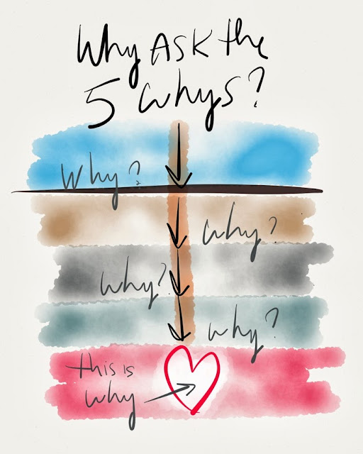
The most important question: Why? (x5)


It's always the hardest question to answer and even a harder one to evade, especially in the 5th iteration of the same question. The heart of the matter is often a surprise to both the questioner and "questionee." Try it next time a client asks you to create a "viral" video for them...

Sunday, September 15, 2013

The calculus of success.

"Just do it" works for the simpler things, but when it comes to bigger, more complex objectives you need a different approach. If you can parse the big project into sections and arrange them in order of "enjoyment" or fun-to-do, the big job will get done with the least amount of pain and procrastination.

The "x" axis could also be configured in terms of the main task's "difficulty." The curve will then become inverted: the easiest tasks at the beginning, with the most difficult one at the end.

What constitutes "difficulty" and "enjoyment" will always have very personal characteristics, so this is probably a technique best reserved for singular working sessions and not a collective one.


Sunday, September 8, 2013

Patterns with meaning.

Your hypothesis and area of interest predisposes you to look for a particular set of stimuli. How can there be any meaning in what you see or sense without some prior experience of it?

Finding patterns that have meaning is a singular activity, sharable only when you have made the discovery yourself first. Creating a data set, amassing a body of research or distilling a literature review is the first step. You can collaborate freely at this point. This is the point of divergence where you intentionally reach beyond the initial scope of your interest. How can you know where your interest really lies, unless you know where the boundaries are?

I'm interested in Lake L'Amable, a small, deep, spring-fed body of water just south of Bancroft, Ontario. If you are too, then this pattern has meaning to you as well.


The biggest black blog is the actual lake (aerial view) and 
it's just off the main hwy. (#62) 


Thursday, September 5, 2013

Visualizing: thesis, antithesis and synthesis


This is a whimsical take on positing a thesis and antithesis, concluding with a synthesis. True concepts don't come together or are synthesized in such a straightforward fashion. I've obviously just visually "forced" the final frame. However there is a peculiar an interesting revelation here. Notice that the "climbing man"as the central figure against the ground of a mountain scape does not actual change   shape or form and yet looks completely different in "antithesis" and "synthesis". He's exactly the same, just "reflected" on the x-axis and rotated 90 degrees clockwise.

Visually the images are appealing in every iteration ( at least to my eye). And the "solution" or synthesis required a relatively simple manipulation of form, to work. Is there a process embedded in this exercise that has any bearing on creative problem solving?  (A corollary to this visual demonstration
exists in geometric theorems that are proved through visual manipulation only.)